Case Study
Building a packaging system with room to evolve.
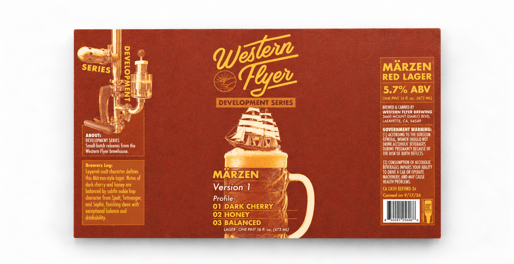
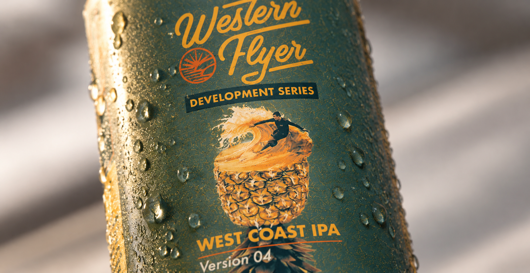
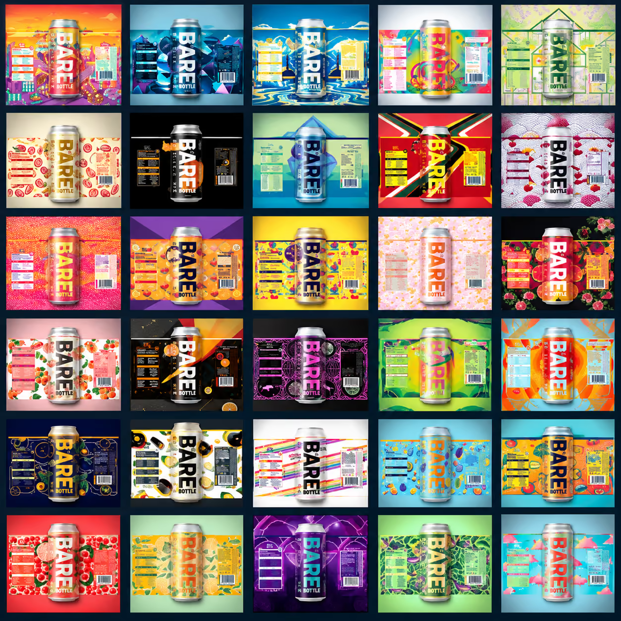
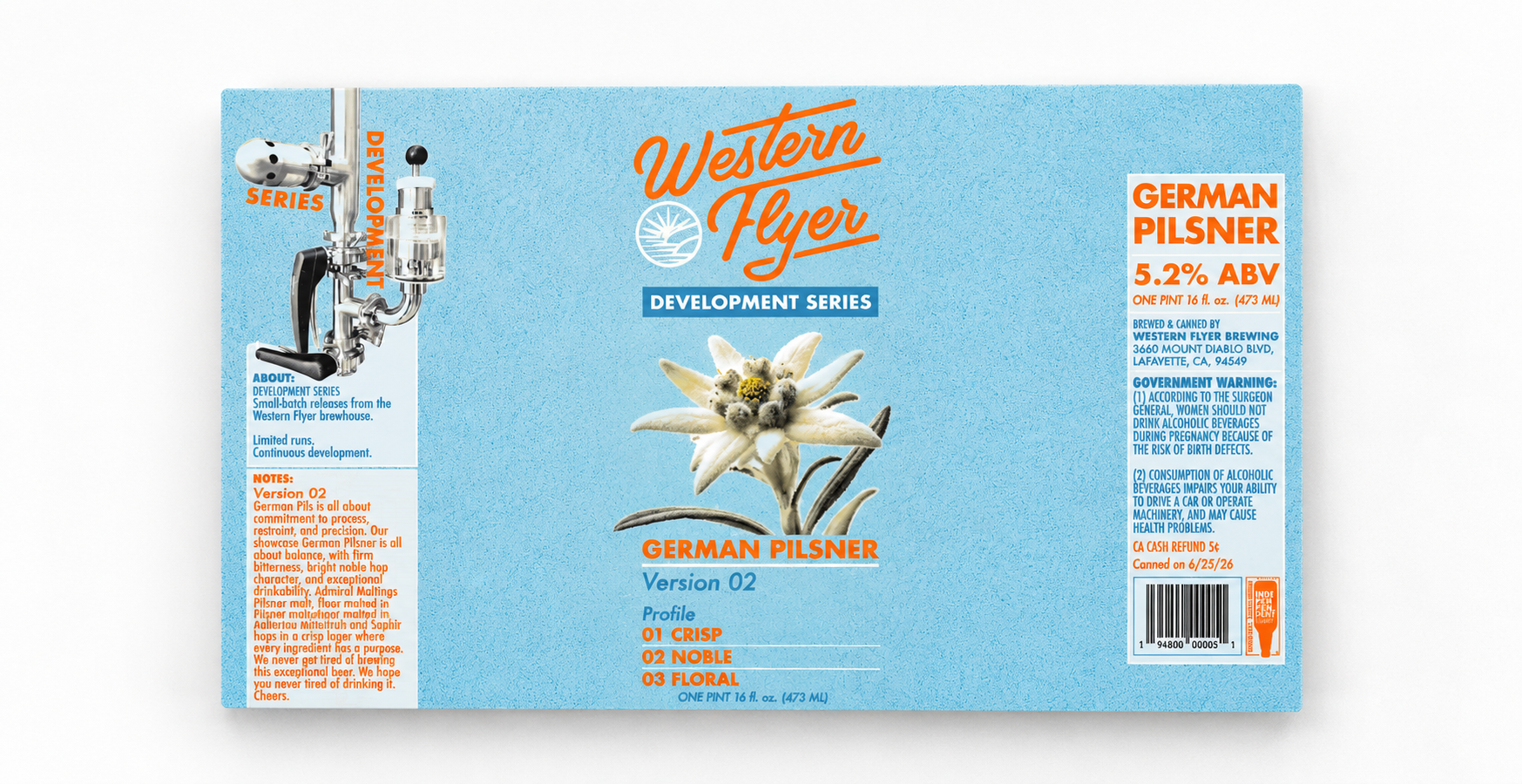
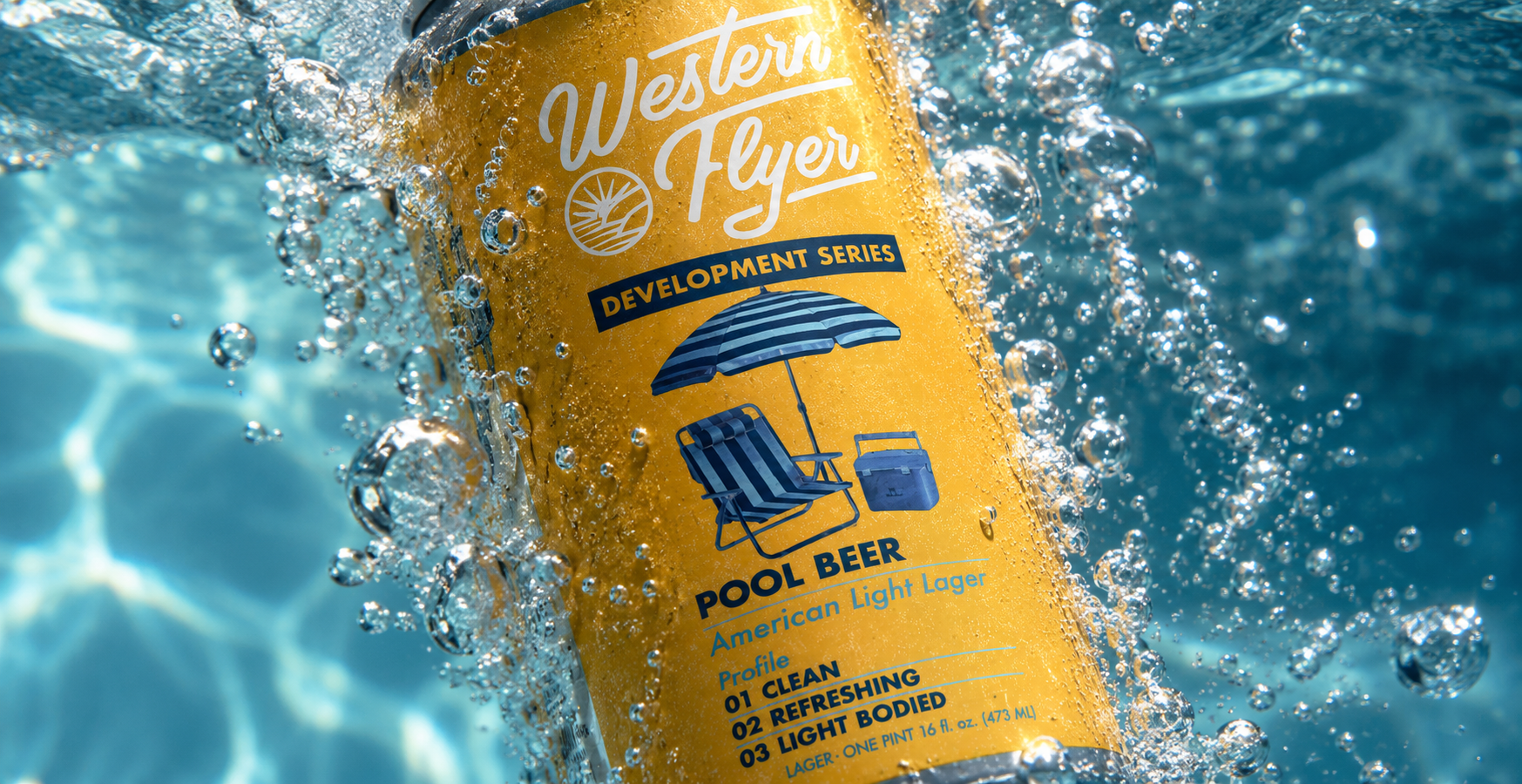
Western Flyer Brewing Co. needed a packaging approach that could give each beer its own personality while maintaining a recognizable brand across the broader lineup.
My work focuses on translating the Western Flyer identity across cans, labels, and packaging—balancing consistency with enough flexibility to make individual releases feel distinct. From illustration and typography to production-ready artwork, each piece is designed with both shelf presence and the realities of print production in mind.
The result is an evolving family of products that feels cohesive as a collection while giving every beer its own visual identity.